

FIELD GUIDE
TIMELINE: 8 Weeks
TYPE: Academic (2021)
ROLE: UX/UI Researcher & Designer
PLATFORM: iOS
Field Guide is a crowd-sourced mobile application designed to help users find, identify, and harvest wild edibles around their community.
Food insecurity and foraging
The Challenge
According to Feeding America, in 2020 an estimated 42 million people suffered from food insecurity, which has been defined as a lack of consistent access to enough food to live an active, healthy lifestyle (Source).
With growing concerns over increased food insecurity globally, researchers have suggested the ability to engage in self-provisioning through food foraging as a means of addressing immediate food insecurity (Source).
Barriers to Food Foraging
SECONDARY RESEARCH
In 2017, researchers interviewed 105 foragers in Baltimore, Maryland to understand behaviours, motivations, and barriers to food foraging (Source).
In total, 323 unique locations were reported, 64% of which were located within Baltimore City, suggesting food foraging is prevalent even within the downtown core. When asked about barriers to foraging respondents cited lack of time, lack of knowledge, and concern for their safety.

Improving Accessibility
reframing the challenge
To further understand the problem space and the lived experience of users, I conducted 3 interviews with foragers ranging from 40-90 minutes in length.
When asked about barriers to foraging, all participants placed emphasis on the effort and time required to research, locate, harvest, and process natural materials.
With this in mind, I hypothesized that improving the accessibility of knowledge, identification, and ideal foraging locations could empower individuals to engage with and utilize the natural resources around them. Ultimately, doing so could have a tremendous impact on food insecurity, and access to nutritious foods.
How might we help users find and forage wild edibles in order to make using natural resources more accessible?
What would evan do
PERSONA AND EXPERIENCE MAP
I developed a persona based around interview insights to help guide my design decisions and ensure any solution I created would be rooted in an empathetic approach, targeting my user’s goals and pain points.
I put myself in Evan’s shoes and developed an experience map highlighting some key moments during his journey. This allowed me to narrow in on potential opportunities where my digital solution could be useful.
ARTICULATING THE USER’S NEEDS
Primary Task Flow
I created user stories to helped me understand the user’s perspective and the specific tasks required to achieve their goal, ultimately allowing me to define the functionality of the solution.
After categorizing each user story into functionally related tasks, known as epics, I was able to focus on what features would serve the greatest number of users and ensure I brought value with any deliverable.
I focused on the task “find wild edibles near me” to help define the steps users might take within the solution.
EXPLORING CONCEPTS
WIREFRAMES
With consideration for the task flow and persona, I explored various layouts, elements, and functions.
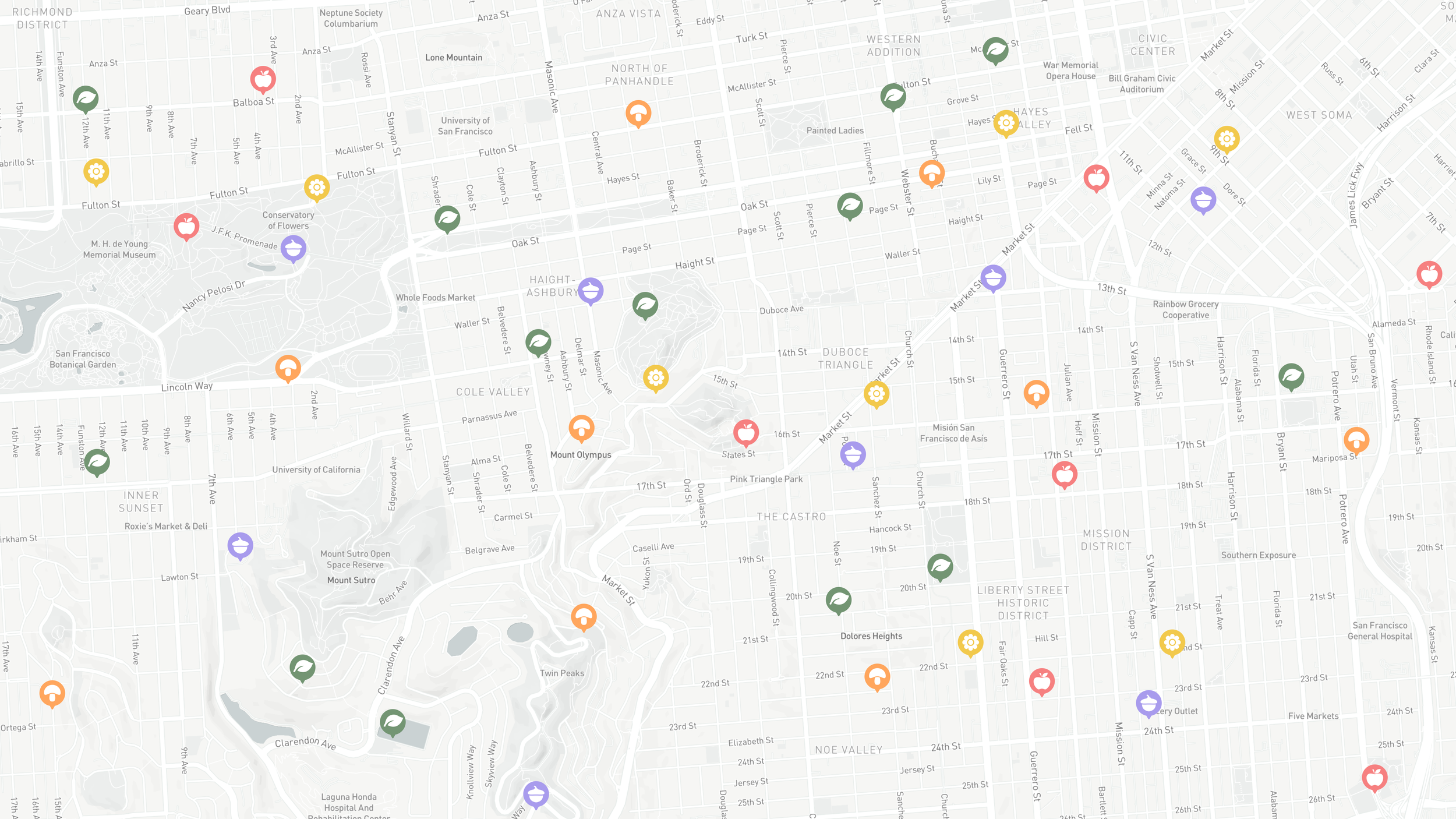
WITHOUT GEOGRAPHY, YOU’RE NOWHERE
usability testing - round #1
I conducted 2 rounds of testing with 5 participants each, gathering feedback on the usability of the design. This allowed me to observe how real users interacted with the app and understand any potential issues, and inconsistencies within my design.
After exploring the initial prototype, all of the participants suggested that incorporating a map directly within the application would be beneficial, allowing them to quickly survey surrounding areas.
DESIGNING A FAMILIAR EXPERIENCE
usability testing - round #2
With the second version of my prototype, all participants were able to complete each task successfully, suggesting the design changes improved the usability of the design.
In this round, I prioritized adding directions with distance and time to the map, adding text to the bottom navigation bar, as well as adding a “city view”. I prioritized these changes as they are elements and features a user would expect to see in a map application such as Google or Apple Maps. In doing so, I can ensure the action, process, and experience is similar.
adding a little emotion
BRAND IDENTITY
Using bright and warm descriptive words, I created a moodboard to help curate a certain feeling when using the solution and began to develop a brand identity.
I settled on the name “Field Guide” and began to explore how to incorporate the organic nuances of writing on paper within the logo, as the use of notebooks during foraging was mentioned during the interview phase.
In Figma I designed a wordmark and application logo, incorporating imagery to help further develop the brand.
Bringing it all together
usability testing - round #2
I chose a minimal colour palette as I knew the solution would be very content heavy with text, images, and map renderings.
I developed a high-fidelity prototype for the primary task flow and added the additional flow of “find more information” to appeal to a less experienced or beginner forager.
Access for all
DESIGN IMPACT
When it came to understanding the impact of the design, making foraging as accessibility to wide variety of users was critical. This was achieved by leveraging existing interfaces to create a familiar experience, ensuring information was concise, accurate and followed a consistent hierarchy, as well as finding a balance between simplicity, functionality and visually pleasing designs.


GETTING OVER PERFECTIONISM
KEY Learnings and next steps
This entire process was both incredibly rewarding and challenging. I found I would get caught up in making everything pixel perfect, and any work I did would end up being scrapped after the first round of testing, showcasing how vital early research and testing is to the design process.
Moving forward, working to be comfortable with my work and trust both myself and the design process, as this will save me lots of late nights.
